Button Up And Strap In
We’re talking a hot button issue within VR development this week - user interfaces. Do you need one? If so what's in it, how's it look, how physical are the interactions?
Hell there are a lot of questions around the topic, and no solid answers. Why? Well virtual reality is still such a new medium, even if it was done almost 30 years ago only to resurface last decade. At the same time user interfaces have become more important over the past twenty years, so it's not like we're starting from scratch. And to some degree the entirety of VR is the user interface, but that’s not what we want to talk about today.
A Giant Problem inherits all the issues of user interfaces in VR. Namely that they can't be pushed to the edges as they are in other video games. Poor eyesight on the edges means a player won't get all the information they may need or want. Take the standard first person shooter, what do you have to know - player health, ammo, or energy mini-map, weapon status, and maybe something else. Imagine cramming that in the center of the screen.
The fact we're making a fantasy game also affects the constraints we've put on ourselves for the UI design. Namely in that we're trying not to have any UI, well in-game UI also known as a HUD or Heads-Up Display. So there won't be ammo counts, or health bars, or other standard indicators filling your screen. We could magic our way around this, but have felt it unnecessary. Instead we have something special to help you in that regard. We just can't talk about that yet.
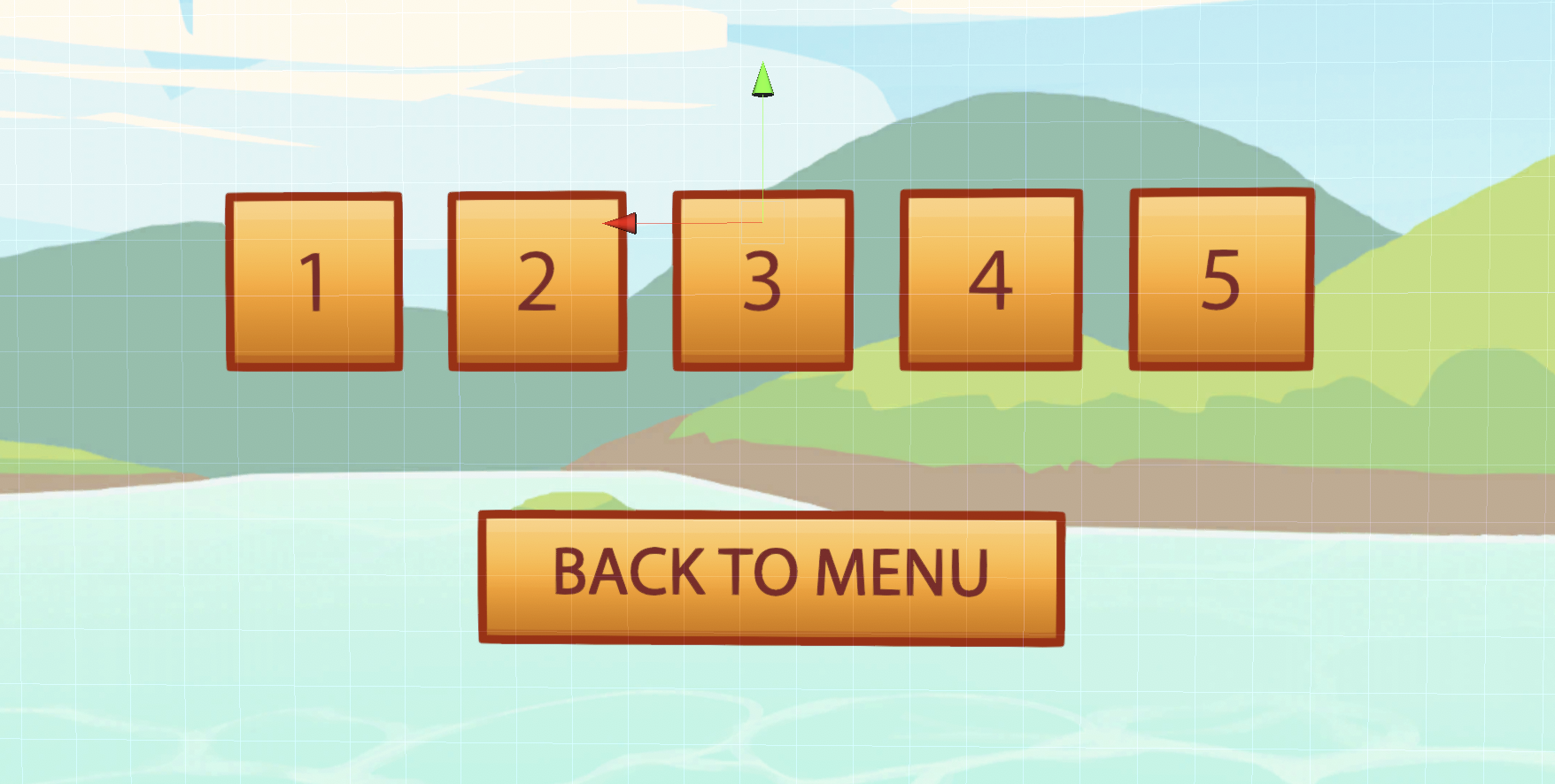
Where we do have UI is in the actual menus of the game. Rather than having a scene that you interact with, similar to SUPERHOT VR, we've opted for good ol' fashioned menus. The why is simple - they get you into the game faster, and more players understand what to do.
For new players every type of interaction requires teaching. Even simple things like where to look, how to move, how to grab or activate something take time to comprehend. But most people are use to point and click interfaces. So a simple, well-laid out menu is key. And we’d rather you spend your time playing the game, then trying to figure out what you need to do to play the game.
That’s not to say there won’t be a place in the game where you can go try out all the toys we’ve built for you. It just isn’t going to be the main menu. The menus instead are being designed with flow, ease and purpose in mind. So we’ve looked at the what works in other games, both VR and console, as well as mobile apps. They’re great sources of inspirations, not just because of the years of work and research spent on them, but also because they lack the hotkeys that menus often have on computers.
As awesome as Persona 5’s UI is we’re not going to that extreme. In part because we’re trying to minimize the amount of UI you experience during play. Nor are we aiming for the complexity of something like the Witcher 3 or Destiny 2. The lack of an inventory immediately makes that easier. But having two different buttons for calling up different parts of the UI is a bit much. So we’ve simplified. There’s only one. That doesn’t count any Oculus or Steam menus you can call up.
All that and yet we still can’t show you anything. Maybe that’s a good thing. After all we are trying to keep our UI to a minimum. There’ll be plenty more to see soon. So if you haven’t already, be sure to wishlist A Giant Problem on Steam now!
Get A Giant Problem
A Giant Problem
Smash, bash and mash your enemies as a Giant
| Status | In development |
| Author | Critical Charm |
| Genre | Action |
| Tags | 3D, Fairy Tale, Fantasy, First-Person, Monsters, Oculus Rift, Singleplayer, Tactical, Unity, Virtual Reality (VR) |
| Languages | English |
| Accessibility | Color-blind friendly, Subtitles |
More posts
- Patch 0.09.50May 27, 2021
- Patch 0.09.00Apr 27, 2021
- Patch 0.08.00Mar 16, 2021
- Our 2021 RoadmapJan 15, 2021
- Vote For Us!Nov 26, 2020
- Patch 0.07.02Nov 20, 2020
- Patch 0.07.00Oct 29, 2020
- Patch 0.06.02Aug 04, 2020
- Summertime Update aka Patch 0.06.00Jun 23, 2020
- Patch 0.05.00May 28, 2020


Leave a comment
Log in with itch.io to leave a comment.